Hello!
Slightly under a year ago, we introduced IFS version 3 to the world. With it, we made a step change in how collaborative writing and Star Trek roleplaying could work. We made it so that you didn’t need to run a Nova to run a collaborative writing/roleplaying game, you could cross-post on any game and any mission within the IFS environment, and more importantly, you could do this together. You didn’t need to solo write a bit of a story, email it to someone, etc. – you can add as many people within a chapter and you can write together. Yes, I know it’s not real-time editing yet but that is coming, eventually, to WordPress and we’ll be here when it does.
We also said – “we won’t stop here”.
Since then we’ve:
- introduced several improvements such as the new My IFS page
- we’ve enabled front-end submissions and creation of characters, news, database articles and chapters
- we’ve rolled out Google Classroom for GM Academy
- revamped the database layout at least twice. Probably will keep on at this because it’s a permanent bugbear of mine.
We’ve also had the USS Mercutio transition from Nova to IFS3, the Wabi Sabi now uses IFS3 to showcase its adventures in Tabletop, we’ve had Esquimalt Station, Department Q, and The Traveller’s Rest all start up as the launching points for games in TF29, 47, and 72 and we’ve got two games now actively running on IFS3 – the USS Tanjura and the USS Hou Yi.
Not a bad year really is it?
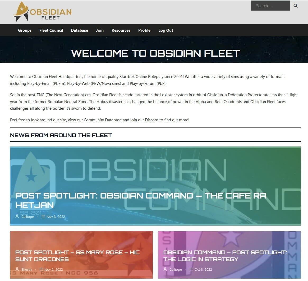
So, when we did this last year, the one thing we didn’t do was a completely bold and significant overhaul of the front-page. We kept 3’s broadly along the line of v2’s front page.

So, very news-centric, existing member focused, but still a lot more colourful than v2 was. Now, this is all well and good, but for prospective players coming into the community – of which we’ve had more than a few – they inevitably ask questions. Questions like:
This looks cool, what exactly do you do here?
Newbro, at any point in the last year
So – in line with a lot of more modern day web practices, we’ve done something about it. You might’ve noticed a change on the front page …

So now, the front page says exactly what we are, front and centre. We’re a roleplaying and writing community decidated to Star Trek – and other- fictions.

One of the little explored things we did when we set up IFS3 originally was use the colour palette we defined for it at the time. Now, we’ve got big colourful sections which show people some of the positives of spending time in Obsidian Fleet.

We’ve even gone as far as a feature grid! Again, this is who we are and what we offer.
Below the fold, you’ll find the existing news and chapters …

Except here, we’ve deprioritised the news and announcements from the centre and we’re prioritising your news.

We’ve overhauled the chapters stuff on the front page to make it a bit more compact, but a lot easier to get round.
Following feedback from our testers, we’ve made some changes to My IFS. It’s gone from this …

to this. We’ve made it more like a traditional panel from a blog including some more of the latest news for you to browse and also expanded the chapters so you can read even more members writing.


We’re also mid-way through the visual refresh of our Fleet Database. New ship layout anyone?

and these now come complete with image galleries, examples of the ships available and deck listings …

and a new species format …

News has also had a bit of a refresh too …

Again, we’ve made it so you can get around the news quickly – incorporating archive links and the recent news in a sidebar on the left.
This all works well on mobile too.
I hope you enjoy the visual refresh. We’re still not finished yet … dark mode anyone?

